
HeyGen Design System: Setting up for a Rebrand and Dark Mode
Project Overview
Client: HeyGen: an AI-powered platform that lets users create high-quality videos with realistic talking avatars and AI voices, eliminating the need for expensive equipment or camera experience.
Role: Lead Design Systems Consultant (via Jaguar Studio)
Timeline: February - October 2025
Scope: Create and scale a multi-platform design system to support growth, upcoming rebrand, and dark mode rollout. Work as part of the “Tiger Team” a lean team made up of designs and developers working in 2-week springs to set up design system.
Tiger Team: Nick Allen, head of design, Michael Owens, head engineer on Tiger Team, Manuela Odell - Lead design systems consultant
Context & Challenges
Fragmented design library — components and styles were inconsistent across web, mobile, and marketing.
Upcoming rebrand — work needed to pause/anticipate new brand assets while still delivering a functional system.
Dark mode support — team wanted a smooth rollout without doubling design/development effort.
Cross-team collaboration — system had to serve both designers and engineers, integrating with Storybook and code.
I was hired by HeyGen to design and implement a design system ahead of a rebrand being designed by the award-winning, global agency Pentagram. As the design and engineering team was growing, it was apparent that there was a real need for a componentized design system that could support a rebrand, dark mode, and help onboard new designers and engineers.
HeyGen in action! Here I am talking about my design agency in Japanese :)
Goals
Establish a foundational design system in Figma (variables, tokens, core components).
Create a scalable structure to absorb the rebrand with minimal rework.
Define processes & governance for contributions, QA, and updates.
Ensure multi-theme support (light/dark mode) via tokenized colors and semantic naming.
Process
Audit & Foundations
Audited existing design assets and live product UI.
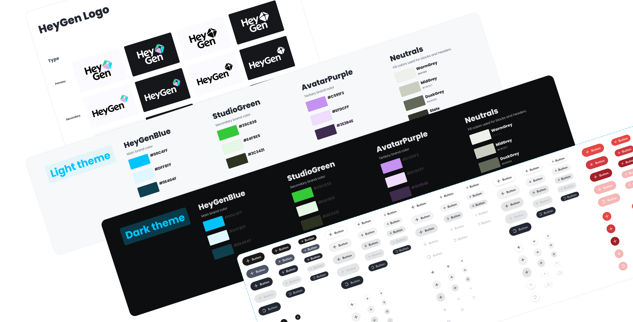
Defined color, typography, and spacing tokens.
Created primitives and semantic variables in Figma.
Set up file structure, library naming conventions, and usage documentation.
When I first joined HeyGen, there was a little bit of structure in place for a design system. On the design side, there was a list of components that were built and another list of components that needed to be built.
On the development side, they only had buttons being reused but even so there was no system or rules around how buttons should scale within modals or other containers, or even how they should stack in certain instances. With a large rebrand coming, it was important that we move quickly to set up the design system so that once the brand was launched in August or September, we could simply update the colors and merge the changes.
The first thing I did was make sure we had a good color token system. Alongside the rebrand, the team wanted to also set up dark mode to align with HeyGen’s values of being customer & design centric.

Building the Initial System
Created core components: buttons, inputs, modals, navigation.
Applied atomic design principles (primitives → components → patterns).
Integrated with engineering’s Storybook for early QA.
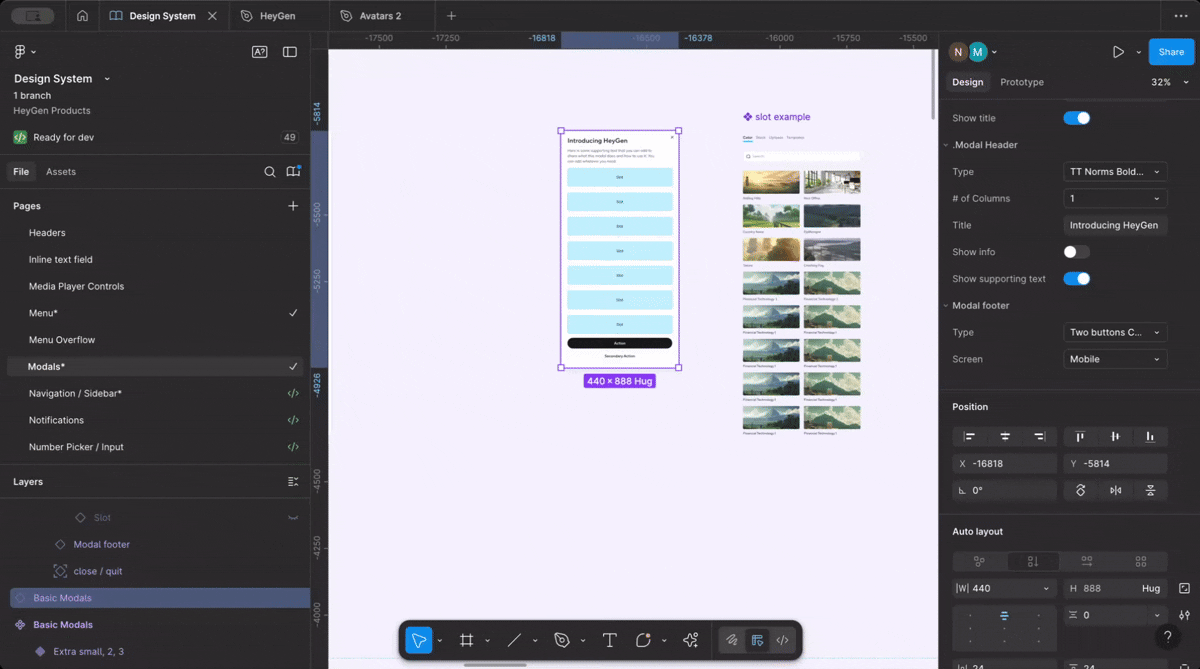
The “Tiger Team” decided to use ShadCN as a component library, which would still give us visual control over the components but would provide us the source code. I downloaded the Figma ShadCN plugin, which also helped me think about how complex components could be built, for example sliders which needs to scale and have flexibility for label inputs.
Slot integration: I introduced the team to the concept of using “slots” in components to allow maximum flexibility. Slots were used in modals since there needed to be flexibility for marketing content. Slots are built as “instant swaps” in Figma, which is also supported by Radix.
How Slots work
The design system in action


Rebrand Integration
Paused on scaling components until rebrand was finalized.
Created a merge plan: abstracted brand-dependent tokens (colors, icons, typography).
Updated components to reflect the new visual identity without breaking existing usage.
QA’d system across desktop, mWeb, and marketing templates.'
Once we received the rebrand components, which included a new brand color, logo, color scheme, and visual component, the design team started to play with the new elements & colors to explore how we wanted the digital product to evolve. Some of the feedback we continuously heard is that there was too much purple, that our design relied too much on purple. This was an opportunity to break away from that and be more playful with color, gradient, imagery, and whitespace. When we did a direct color swap, what we found is that our new brand blue did not pass accessibility with a black text color.
We decided to make our primary button black with white text and use our blue as a highlight color. On dark mode, our primary button would become our brand blue.
We also rounded our buttons completely from rounded rectangular, as well as other elements like notifications.
Since our rebrand had an organic feel to it, rounding out our elements allowed us to bring in a little more creativity and playfulness.
QAing as a company: We rolled out the “prism rebrand” to the entire HeyGen team which actively did a deep dive into our product to uncover where things were broken, where we were still using the purple, and any other visual design issues.
It was really fun to see the entire team actively taking an interest in the rebrand and QAing. They got deep into the nooks and crannies of our product. At peak, we had 120 JIRA tickets related to the rebrand. In two weeks, we felt very confident to rollout the rebrand to all our customers and did so on September 15th.
Design exploration

Before Prism Rebrand
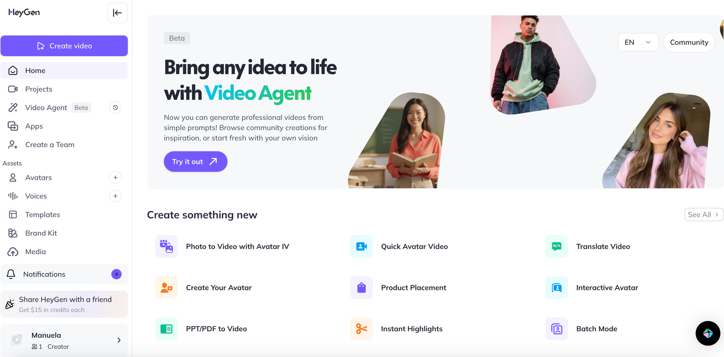
Before Prism Rebrand

Before Prism Rebrand

After Prism Rebrand
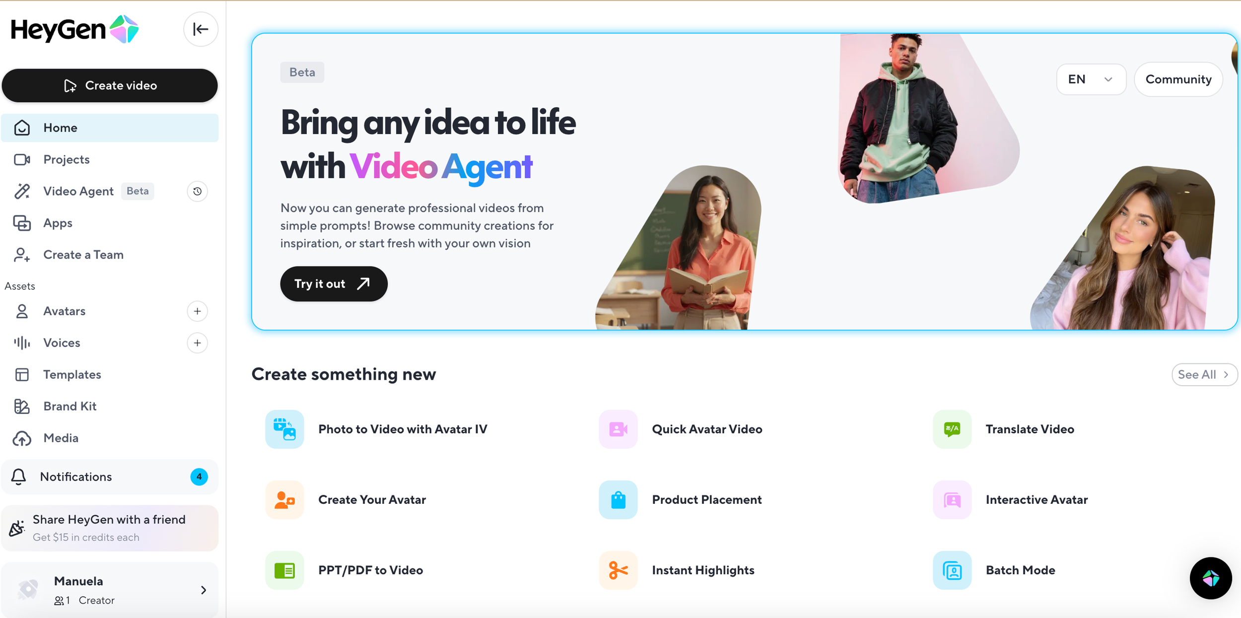
After Prism Rebrand

After Prism Rebrand

Dark mode rollout
Used dual-theme tokens (light/dark) from the start.
Built component variants that auto-switch with theme.
Collaborated with engineers to ensure smooth token handoff → CSS variables.
QA’d contrast ratios and accessibility.
Once our prism rebrand was in a good place, we turned our attention to dark mode. Since we set up tokens well in advance and using tokens in Figma it allows us to test our components, it was relatively seamless.
Our team QA’d the product in the same way as the rebrand to discover broken colors, components, and pages. Dark mode rolled out on October 1st.

Metrics
When a rebrand happens and there is a marketing push around it, metrics like page views, sign ups, etc are not as relevant because it doesn’t indicate actual stickiness.
However a very exciting metric that highlighted that our rebrand did include a better user experience is the following:
“Looking at metrics around video agent: 15966 videos created yesterday as the stats tally into a new day. More than double our projections.”
Other metrics:
% of users that switched on dark mode: 69%
% of users that stuck to dark mode after two weeks: 50%
Mobile Design System
Audited mobile design system to develop list of components
Designed components based on current designs
Worked with mobile designer Tiffany to decide how to use rebrand in the new design system
While waiting for the rebrand, we decided to see how we could help the mobile design system which consisted of only a sole designer who felt overwhelmed by the fact that she held all the information and hadn’t set up a system.
I helped Tiffany decide which components we could add and how to streamline similar components that visually looked different.

Outcomes & Learnings
Outcomes
Unified web design system library in Figma with 46 components and 69 color tokens and 45 typography styles, as well as some gradient styles.
Faster designer onboarding: two new designers were onboarded in 7 days vs a month.
Improved consistency: visual alignment across all HeyGen surfaces.
Rebrand agility: system absorbed brand update in 2 weeks vs. weeks of manual updates.
Dark mode launch with minimal overhead.
Learnings
Anticipation pays off - despite the need to move fast, setting up tokens, variables, and creating a system on how to work cross-functionally paid off.
Documentation is key - when designers were unclear what component to work with, they would detach. The better and clearer my documentation (while also keeping it as brief as possible), the less they detached
Don’t take things personally - good designers need to move swiftly. When components are detached, it is an indication of two things - the component is not flexible enough or your designers don’t know how to use the component. Keep good relationships between teams so that you can define issues and bugs in the design system.