
Hawkins: Scaling Netflix's design system to unblock growth teams on TV
Role: Senior Product Designer, Hawkins Design System
Duration: 8 months (component lead: 8 weeks)
Scope: Web, iOS, Android, TV — across 4+ feature teams
Team: I led the Static List redesign, partnering with 2 feature designers, a schema architect, and 4 platform engineers. Reported to Josh Mateo, DM.
Project Overview
Over 8 months on Hawkins, I contributed to 21 components across the system; some net-new, some improvements to existing patterns. This spanned communication components with work shipping across web, iOS, Android, and TV.
Two threads ran through most of it: unblocking feature teams who needed components the system didn't yet support, and consolidating drift where designers had forked patterns outside Hawkins.
I'm sharing the Static List redesign in depth below because it's the project where the systems-thinking, cross-platform complexity, and operational maturity all came together in one piece of work, including a moment that led to me building Hawkins' first formal component deprecation process. If you want to see more, I'm happy to walk through additional work in an interview.
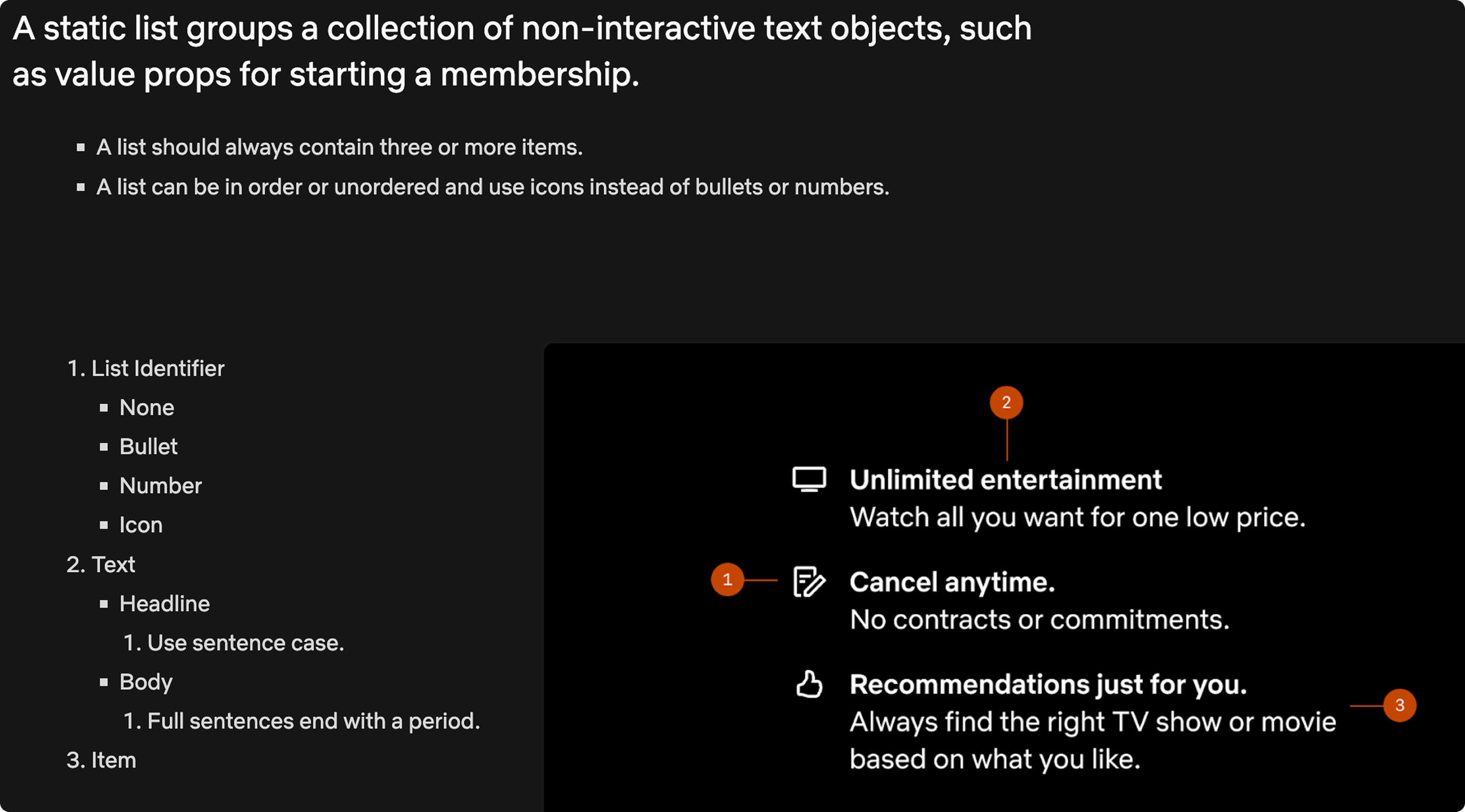
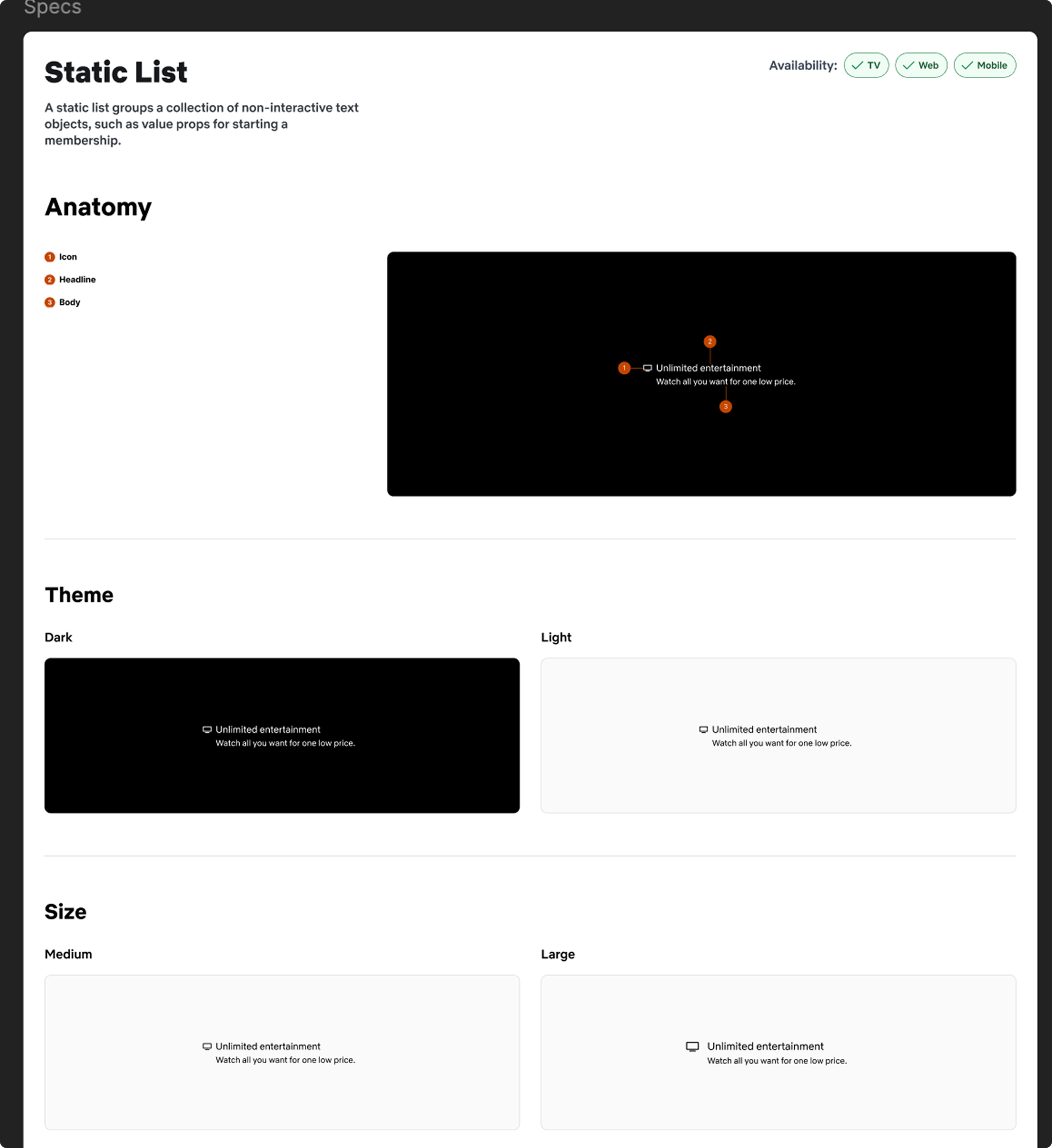
Static List
Team: Lead DF designer: Manuela, Feature team designers: Mete & Ash Grigas; Schema alignment: David Aragon; Developers: Fernando Nova (TV); Noah Blake & Stella Yan (Mobile), Mars & Kyle (web)
Platform: Web, mobile, TV
The Problem
Two Netflix growth teams were blocked from shipping a revenue-positive pattern. Their A/B tests had shown that emphasizing specific words in value-prop lists lifted conversion but Hawkins' Static List component couldn't support word-level color emphasis, and the smallest size broke on TV once localized text was accounted for. The teams were either duplicating the component outside the system or shipping suboptimal layouts.
I led the redesign to unblock them without bloating the system.
Framing the work as a systems problem, not a component request
The feature teams came with a specific ask: "add color overrides and a smaller size." My first move was to resist shipping that directly.
I audited how Static List was actually used across the codebase and found something the ticket didn't mention: an emphasis variant (bold headline + body text) existed in IMS Templates (code-level) but had never been productized in Figma. Designers were reaching for it in ways the system didn't acknowledge.
This reframed the project. The real question wasn't "how do we add features to Static List?" — it was "how has this component drifted from its original design, and what's the right consolidation that serves all three use cases without creating four variants?"
Current design:
The design decisions and what they traded off
Three key decisions, each with a specific rationale:
Replaced the old emphasis property with a semantic high/low emphasis API. The old emphasis property coupled two decisions into one: it bolded the headline and added body text below it. This meant any designer who wanted visual emphasis was forced to also change the information architecture of the list item — breaking the scannable-list pattern that made Static List work in the first place.
I separated intent from rendering. The new property is emphasis: high | low — semantic language that expresses what the designer wants the item to communicate, not how it should look. The rendering is owned by the token and theme layer, which means the visual treatment can evolve (across platforms, across themes, in response to accessibility needs) without breaking every consumer of the component.
This is the shift I'd argue for on any design system: component properties should describe meaning, not appearance. A designer saying "this is the high-emphasis item" is durable; a designer saying "this is the bold-with-body-text item" locks you into a rendering that may not survive the next platform, theme, or localization constraint.
Added a smaller size variant calibrated for TV-plus-localization. Sized against the longest localized strings in our top five markets, not English defaults. This was the kind of decision that prevents a component from shipping cleanly in English and breaking the day a PM turns on German.
Tightened spacing to earn back vertical real estate on TV. Growth teams were already maxing out full-screen card layouts; giving them back 40px of vertical room was worth more than an additional variant.
I rejected two alternatives: a "TV-only" variant (would have split the component, violating one of Hawkins' core principles of cross-platform parity) and full per-character color control (overengineered for the actual use cases, would have created accessibility edge cases).
Mid-implementation, engineering flagged that the emphasis property we were deprecating was in active use on a growth-critical surface. Hawkins didn't have a formalized deprecation process at that point. We'd been adding components faster than we'd been retiring them.
Rather than routing around this (either by preserving the old property or forcing a rushed migration on the consuming team), I escalated to Josh and kicked off a cross-functional project to build a deprecation playbook for Hawkins.
The playbook I led covered:
How to audit current usage before deprecation
Communication templates for affected feature teams
Migration timelines and dual-support windows
Tokenized warnings in Figma and engineering surfaces
A decision framework for when to deprecate vs. extend
The Static List rollout became the first component to use the new process. In the time that I was at Netflix, it was applied to 4 other components.
This is the work I'm proudest of on this project. The component redesign was a good piece of craft. The deprecation process is infrastructure that compounds across every future Hawkins change.
The staff-level moment: building a deprecation process that didn't exist

The new and improved Static List
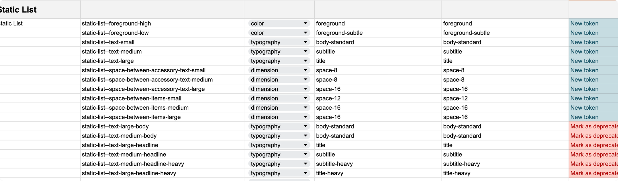
Our token development structure. We used to have to do this manually but now AI takes care of all of this.
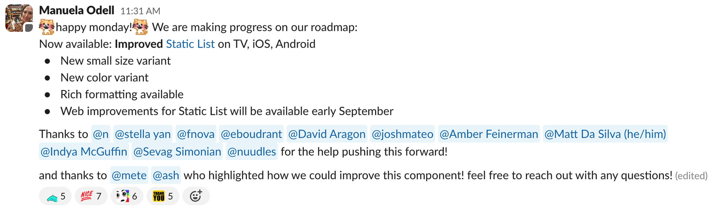
Communicating the updates
Static List in the wild
Outcomes
Shipped across web, iOS, Android, and TV within 8 weeks of design approval
Unblocked growth team experiments that had been held up on component limitations
Deprecation playbook adopted as Hawkins standard practice
If you would like to see more of my work at Netflix, email me at manuela dot odell at gmail dot com
What I’d do differently
Two things I'd change if I ran this project again:
Audit usage earlier. I discovered the active deprecation-blocker in implementation, not design. A usage audit at the start of scoping would have surfaced it a month earlier and shaped the design direction, not just the rollout plan.
Involve motion earlier. Danelle (senior motion designer) joined late in the process. For a component with emphasis states that animate between variants, motion should shape the design, not polish it afterward.
How I think about design systems work, post-Netflix
Design systems pull in two directions: anticipating future needs vs. shipping against current, real constraints. Netflix biased strongly toward the latter, and this project was where I saw why.
We shipped in 8 weeks because we didn't try to solve every hypothetical use case. The deprecation playbook handled the one surprise use case that emerged, cleanly, and is now reusable. Had we spent that same 8 weeks over-engineering variants we didn't need, we'd have shipped a heavier component that still would have had one surprise use case and no process to handle it.
The principle I bring to design systems work now: design the component for today's use cases, but invest in the systems and processes that handle surprise.