
Hawkins: Evolving Netflix's cross-platform design system without fragmenting it
Overview
A simple request that would have forked the system
Two Netflix growth teams asked Hawkins for more control over Static List: color overrides, tighter spacing, a smaller size. Adding what they asked for would have been quick, and it would have left the system with more variants and more debt.
I audited how the component was really used, rebuilt it around one semantic property that works on web, mobile, and TV, and shipped it in 4 weeks. When rollout collided with a template that still depended on the old behavior, I spent the next 4 leading the deprecation process Hawkins didn't have yet.
The Request
The component request was not the real problem
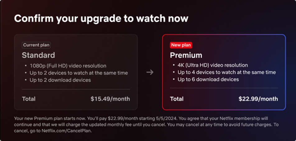
The request came from two growth teams, Multi-House Usage and Non-Member Homepage. Their earlier tests had already shown that a specific treatment converted better on plan-comparison screens: the selected plan's list in stark white on black, the others in a quieter gray, with key words formatted so the value props were easy to skim.
The pattern was validated. What nobody had checked was whether Hawkins could build it. Static List couldn't do three things they needed:
- Color control, so one plan's list could read as quieter than the one next to it
- A smaller size, because the smallest option overflowed vertically on TV once text was localized
- Tighter spacing between items
Designers were already working around the component with color overrides. Each ask was reasonable on its own. Together, shipped literally, they meant a TV-specific fork of a component Hawkins was trying to keep identical across platforms.
The Audit
What the audit showed: nobody used emphasis the way we designed it
Static List had two sizes, one color, and an emphasis variant that bolded the headline and added body text. I looked at where the component was live across product. The emphasis variant was never used that way in production. What teams did instead was override color to make one list recede beside another.
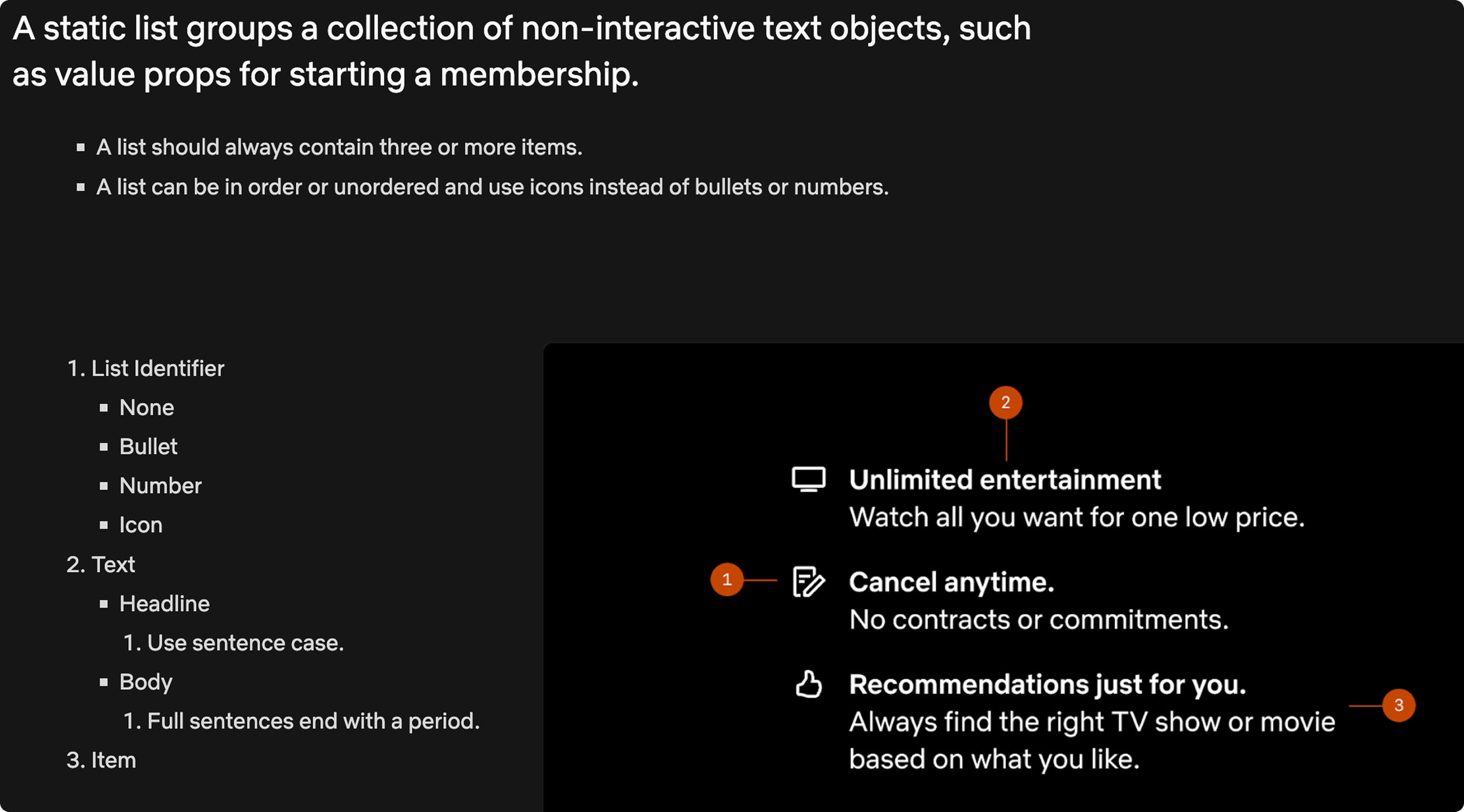
The system's idea of emphasis and the product's idea of emphasis had drifted apart. That changed the question from "what do we add?" to "what does emphasis mean in this component, and can one definition serve every platform?"
The Decision
Four options, one property
We considered four ways forward:
Option
Why not
Keep emphasis as bold
Matched the old design, not how anyone used it
Make emphasized items larger
Cost vertical space on TV, the exact thing teams were short on
Strip emphasis and allow free overrides
Maximum flexibility, zero consistency, accessibility left to chance
A TV-only variant
Split the component and broke cross-platform parity
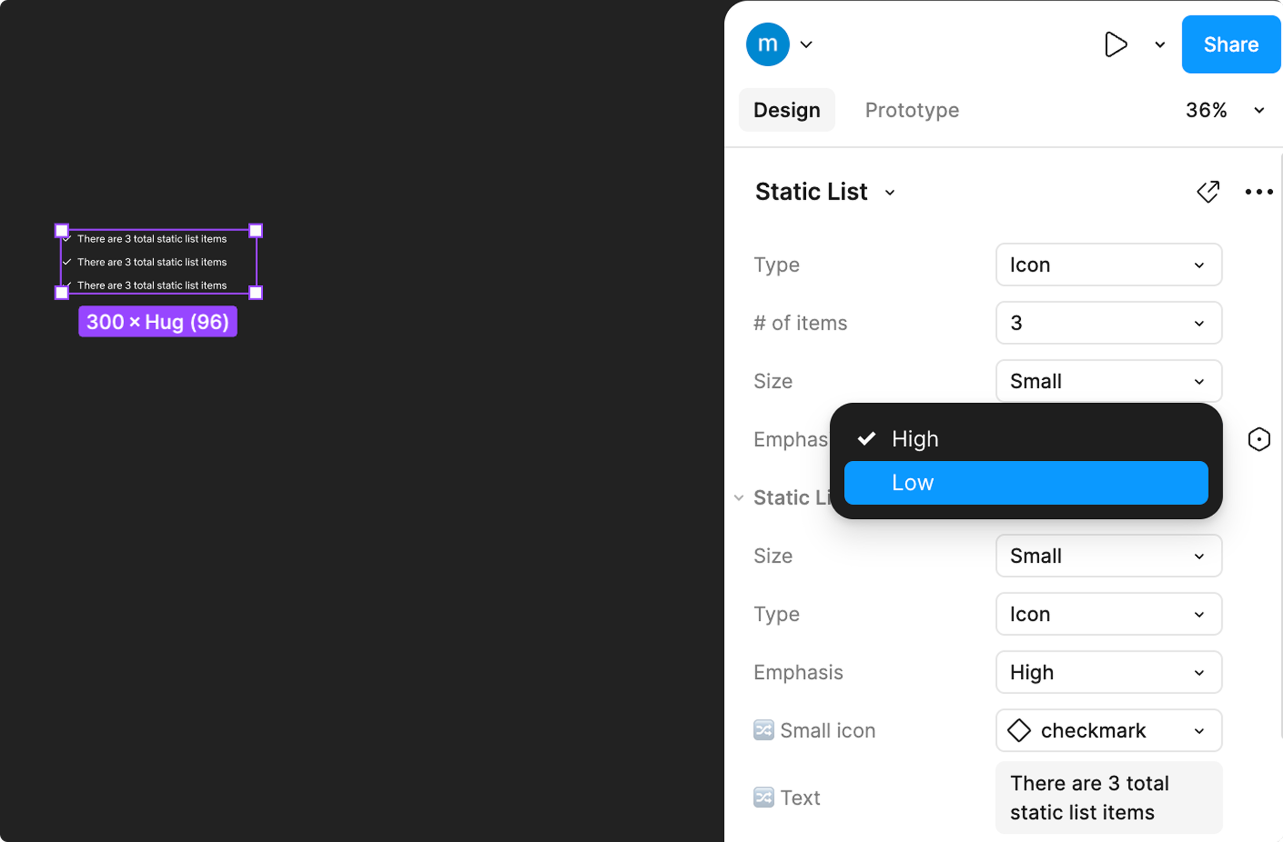
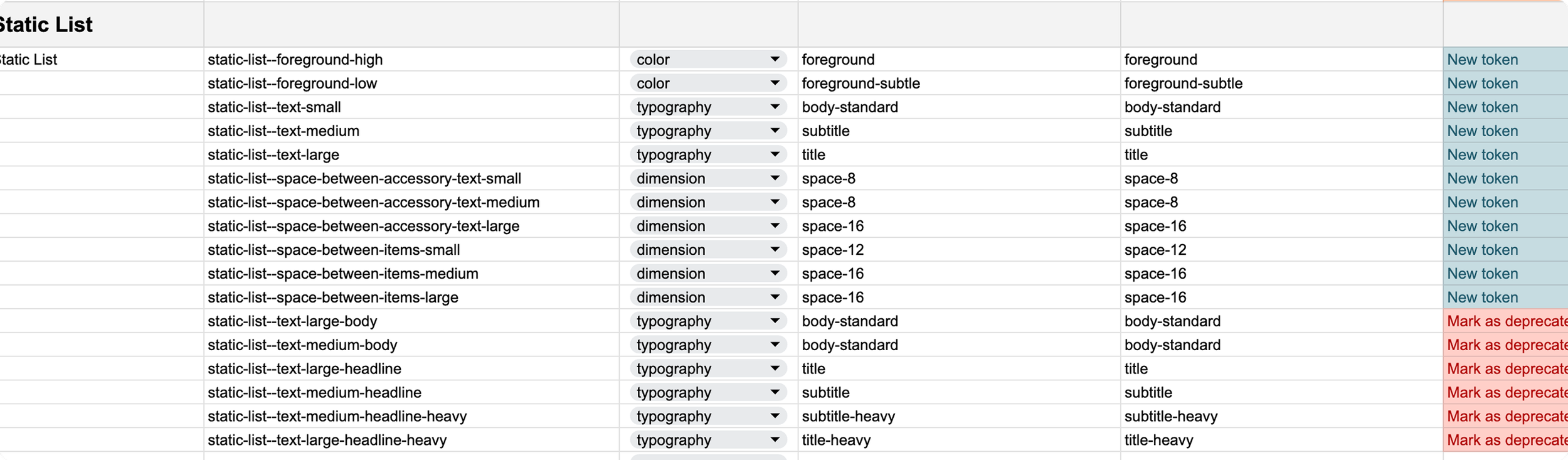
We chose a fifth: keep the existing emphasis property in the API and redefine it as intent. Emphasis is now high or low. On Netflix's dark theme, high renders stark white and marks the selected plan. Low renders a quieter gray for the plans around it. The designer states which list matters, and the token layer decides how that looks on each platform and theme.
What emphasis means before and after
Same property in the API. The meaning moved from appearance to intent.
Before emphasis: on | off
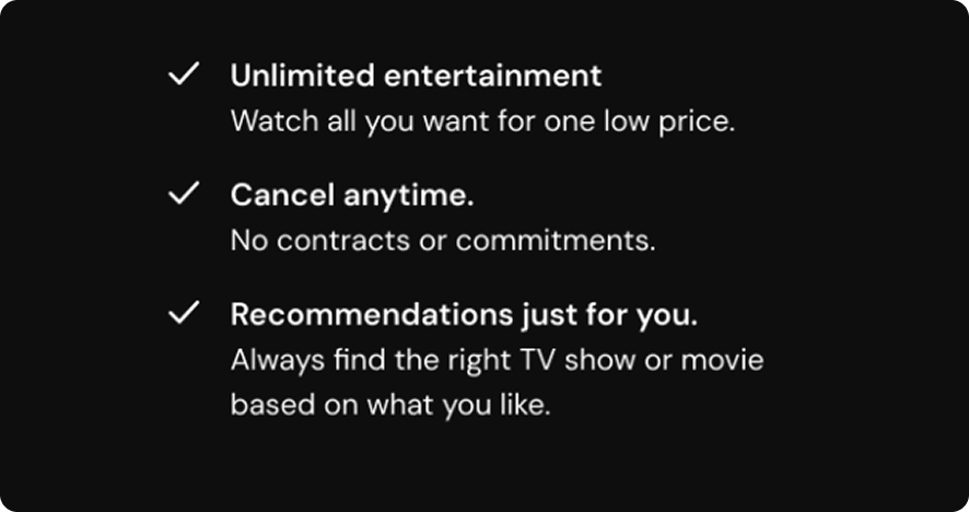
- On: the headline goes bold and body text appears
- One switch changed both style and structure
- In live product, nobody used it this way
After emphasis: high | low
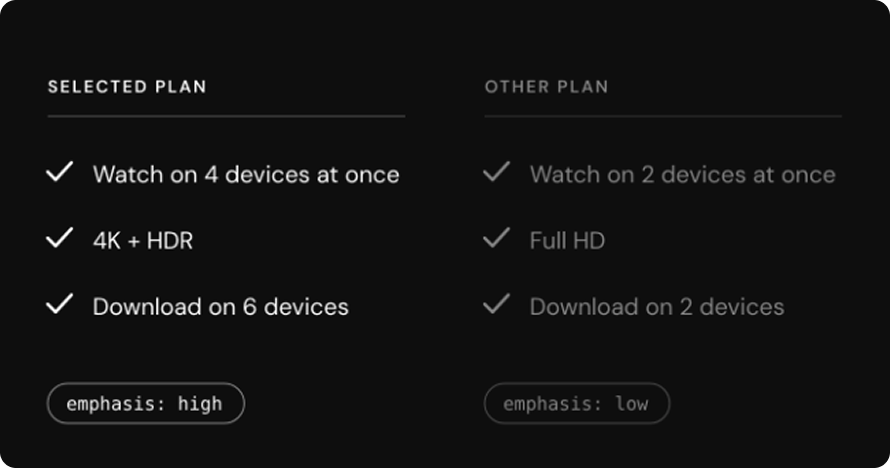
- The designer states which list matters more
- Tokens decide how that renders per platform and theme
- Matches the comparison pattern growth teams had tested
Two reasons this was the right call. It matched real usage, since comparison was the job the component was doing. And because the property already existed in the API, engineers didn't have to rebuild it on three platforms.
Rich text didn't become a variant. Formatting a word inside a list item is a content decision, so it stays an override the designer applies, and the documentation says when and how. Emphasis became a property because it changes what the list means. Formatting didn't earn one.
Alongside it, I added a small size calibrated against the longest localized strings in our top five markets and tightened item spacing to give TV layouts back 40px of vertical room.
The Surprise
The rollout surprise: someone still depended on the old behavior
Mid-implementation, engineering found the old emphasis behavior in a productized IMS template, the kind of template designers start new work from. Changing it wasn't a quiet swap anymore. It was a deprecation, and Hawkins had no process for one. We had been adding to the system faster than we retired things.
With intent-based naming, cross-platform consolidation, and AI readiness all on the roadmap, this was going to keep happening. So rather than patch around one template, I worked with the head of design and seven engineers across platforms to build a repeatable process.
The Playbook
The deprecation playbook
Before anything is retired, the owning designer answers where it is used, whether it touches metrics or monetization, when the flow is next being revisited, and whether there is a replacement to point teams to.
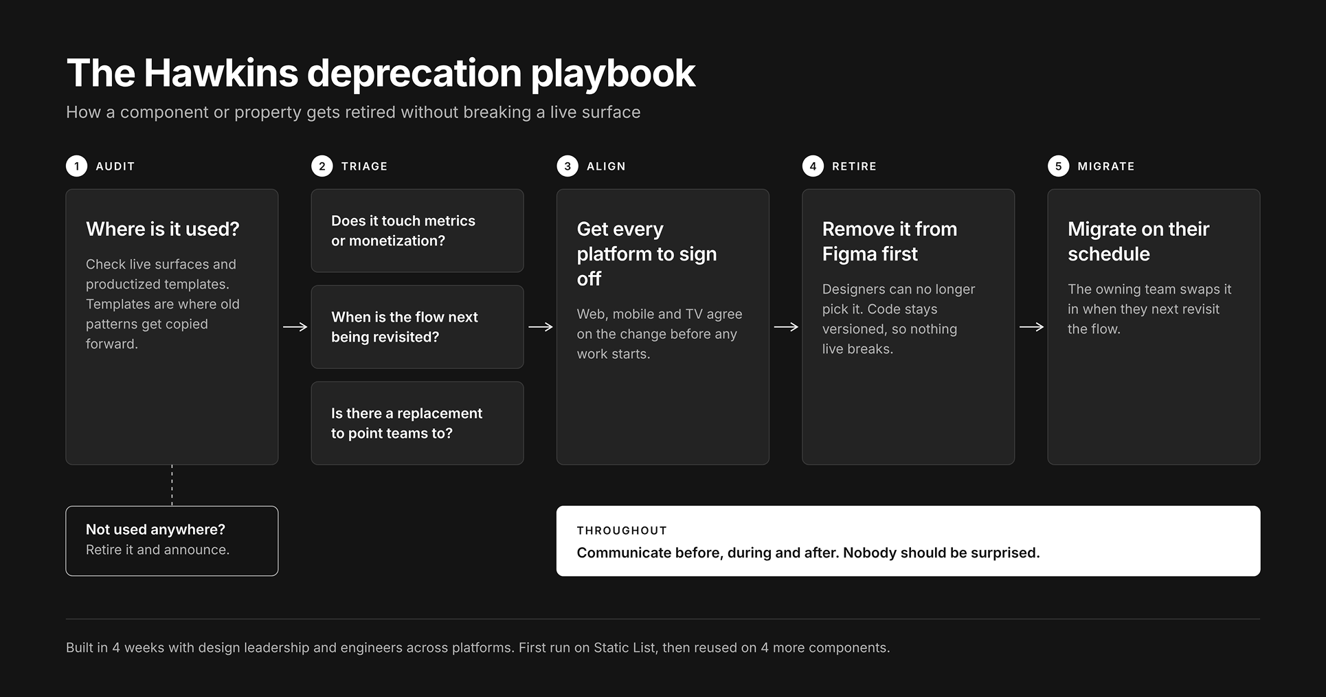
Three rules carry the rollout:
- Remove from Figma first, not from code. The old token stops being available to designers. Engineering can version the component and leave the old one in place, so nothing live breaks.
- Migrate on the consuming team's schedule. The change lands when they next touch the flow, not when it suits us.
- Nobody is surprised. Every platform signs off before work starts, and affected design teams hear about it before, during, and after.
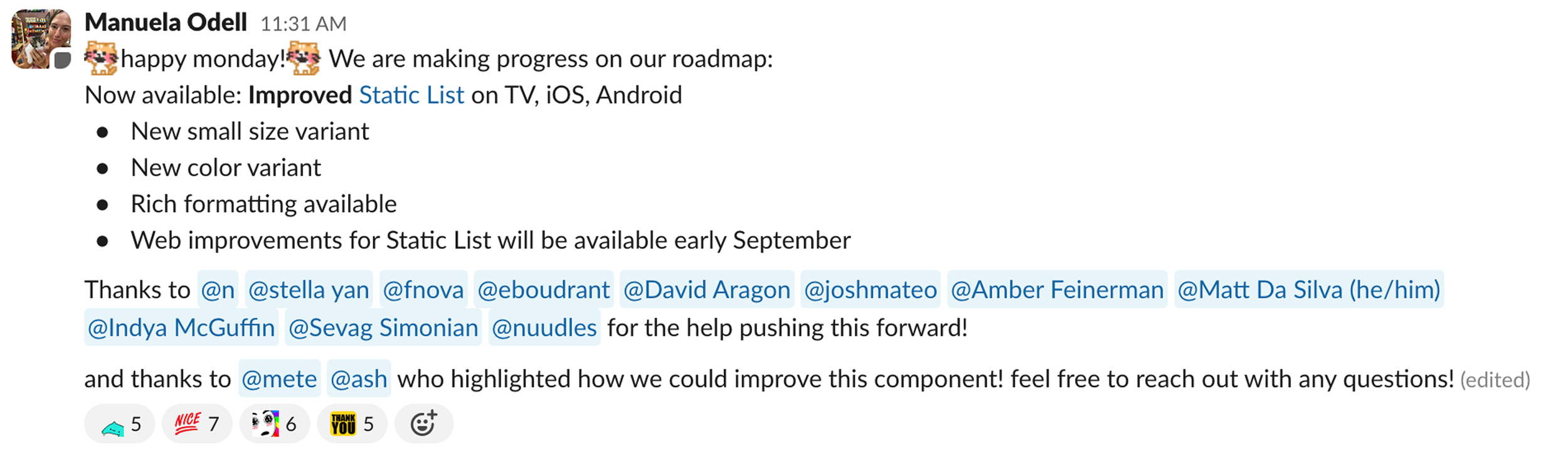
Static List was the first component through the process. It was applied to 4 more while I was at Netflix.
Outcomes
Two teams unblocked, and a process that outlived the project
- New Static List shipped on web, iOS, Android, and TV in 4 weeks
- Two growth teams shipped a conversion-tested pattern inside the system instead of forking it
- One semantic property replaced ad hoc color overrides
- Deprecation process built in 4 weeks and adopted as standard Hawkins practice
Static List was one of 21 components I worked on at Hawkins. Most of that work followed two threads: building what feature teams needed that the system didn't support yet, and pulling forked patterns back into the system.
Reflection
What I'd do differently
I audited live product surfaces and missed productized templates. That blind spot is why the dependency surfaced in implementation instead of scoping. Templates are now the first place I look, because they are where old patterns keep getting copied forward.
What I took from it
Design the component for the use cases in front of you. Put the extra effort into the process that handles the surprise, because there will always be one.