
Hello, World!
Priori Legal: Updating a legacy editing pattern
Editing profile information is a key action our users take frequently. We had a complex editing function with our practice areas & proficiencies which had two layers of options.
Duration: 2.5 months
Team: Manuela Odell (Lead designer), Nick Olivo (Product manager), Mike Milner (CTO)
Impact: 100% decrease in customer service tickets related to practice area editing modal

The Challenge
Lawyers frequently edit their practice areas and proficiencies, but our legacy modal was confusing:
Two disconnected panels (categories vs. subcategories)
Users unclear about next steps (“add” then “yes”)
High support burden from lawyers unable to self-serve
Goal: Redesign the experience to be intuitive, efficient, and error-proof.

Process

1. Identifying Pain Points
Feedback: unclear relationship between left/right panels
Awkward two-step process (“add” + “yes”)
Missing proficiencies created frustration
2. First Iteration
Moved to a vertical layout (subcategories below categories).
Clearer hierarchy, but created long scrolling lists → not scalable.

3. Research & Inspiration
Looked at Airbnb and DoorDash patterns.
Both use dedicated edit screens, but this conflicted with our modal-first system.
Liked Airbnb’s “view mode” + edit mode toggle approach.
Airbnb

DoorDash


4. Iteration & Testing
Prototyped an edit mode toggle with selected options shown by default.
Feedback: still too busy and overwhelming even when graying out the Save button to allow user to focus on task.
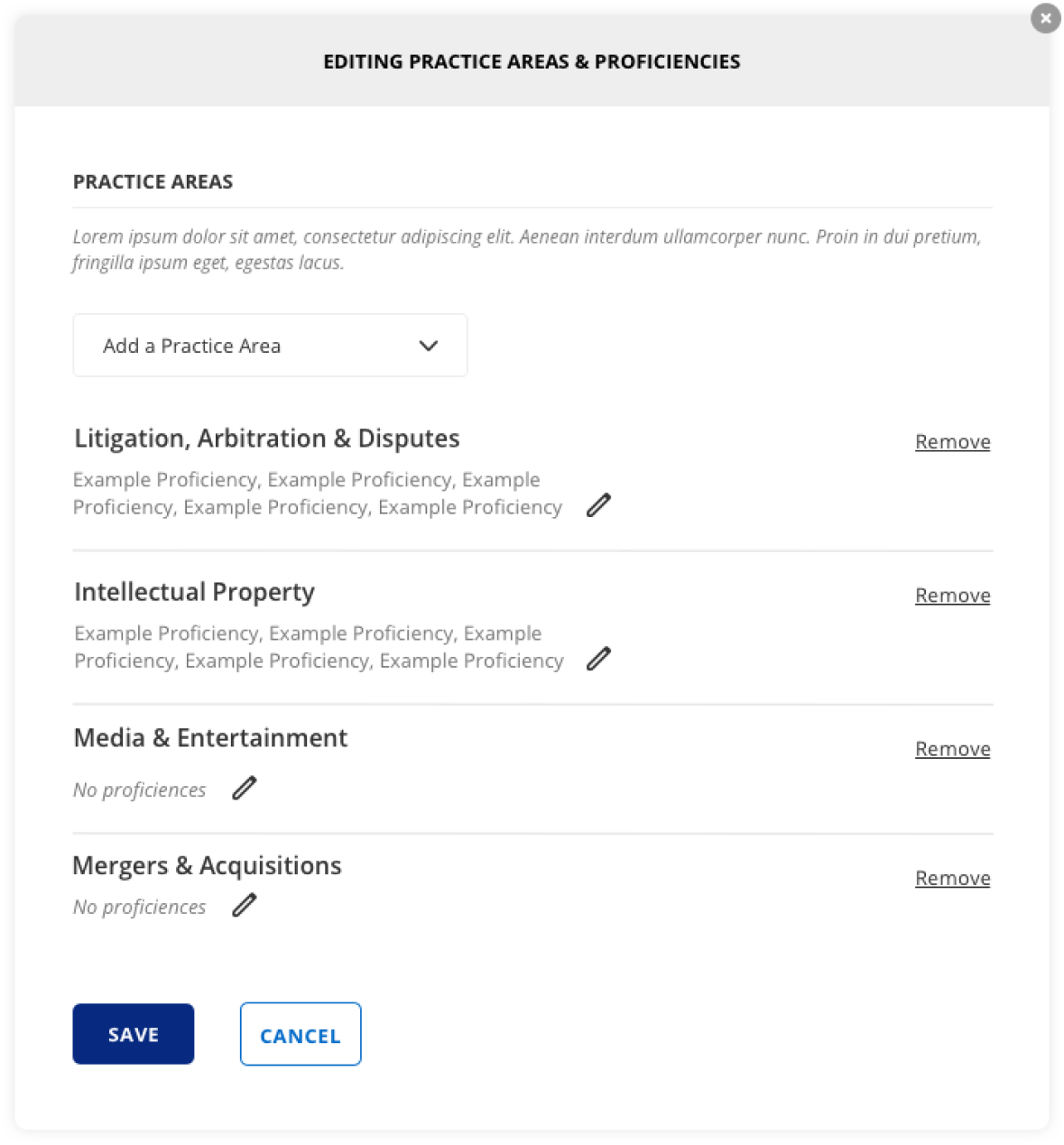

Final Design


Adopted tag pattern for subcategories instead of checklists.
Benefits:
Cleaner UI, less cognitive load
Faster to build
Easier data handling when removing items
Descriptive text buttons make it clear what user should do
Results
✅ 100% reduction in customer service tickets
✅ Sales reps more confident demoing feature
✅ Smoother onboarding webinars
✅ Strong reminder: sometimes the design system isn’t enough—flexibility matters