
Priori: Designing decision-grade data visualization
Duration: 3 months
Team: Manuela Odell, lead designer; Nick Olivo, product manager, Yaniv Savir, lead engineer

Overview
Priori is a legal data and analytics platform that helps companies make smarter decisions about outside counsel by analyzing law firm performance, pricing, and outcomes. By combining historical data with benchmarking insights, Priori enables legal teams to select firms more confidently, manage legal spend, and justify decisions with data rather than intuition.
As the Priori product continued to grow in terms of how much data it was handling, our users were needing to be able to make faster decisions based on this data. Our basic tables and graphs were not providing users with enough data to make decisions and as a result, they were spending less time on our product or at least taking the raw data, and having to make their own assessments.
The Challenge
Priori’s platform helps companies make smarter decisions about legal spend by analyzing law firm performance, pricing, and outcomes. While the product already surfaced valuable data, the way that data was visualized limited its usefulness.
One key view relied on a single, high-level pie chart that showed a basic breakdown of firm performance. While technically accurate, it failed to answer the questions users actually had:
Is this firm expensive relative to others?
How does this compare to the average?
What does “good” or “bad” really mean in context?
Can I make a decision from this, or do I need to dig elsewhere?
The visualization communicated a snapshot, but not insight. Users could see the data, but they couldn’t reason with it.
The challenge was to evolve this simple chart into a richer, decision-ready visualization without overwhelming users or sacrificing clarity.
Understanding the user’s need
Priori’s users are often:
Legal operations professionals
In-house counsel
Decision-makers comparing firms under time pressure
They don’t want to analyze data. They want to understand it quickly and confidently.
Through collaboration with product and engineering, it became clear that the visualization needed to:
Provide context, not just values
Show relative performance, not just distribution
Surface benchmarks and averages directly in the chart
Scale for future metrics without redesigning from scratch
Visual Research & Design Approach
Before refining the final visualization, we explored a range of visual patterns to understand how different formats communicated performance, comparison, and context.
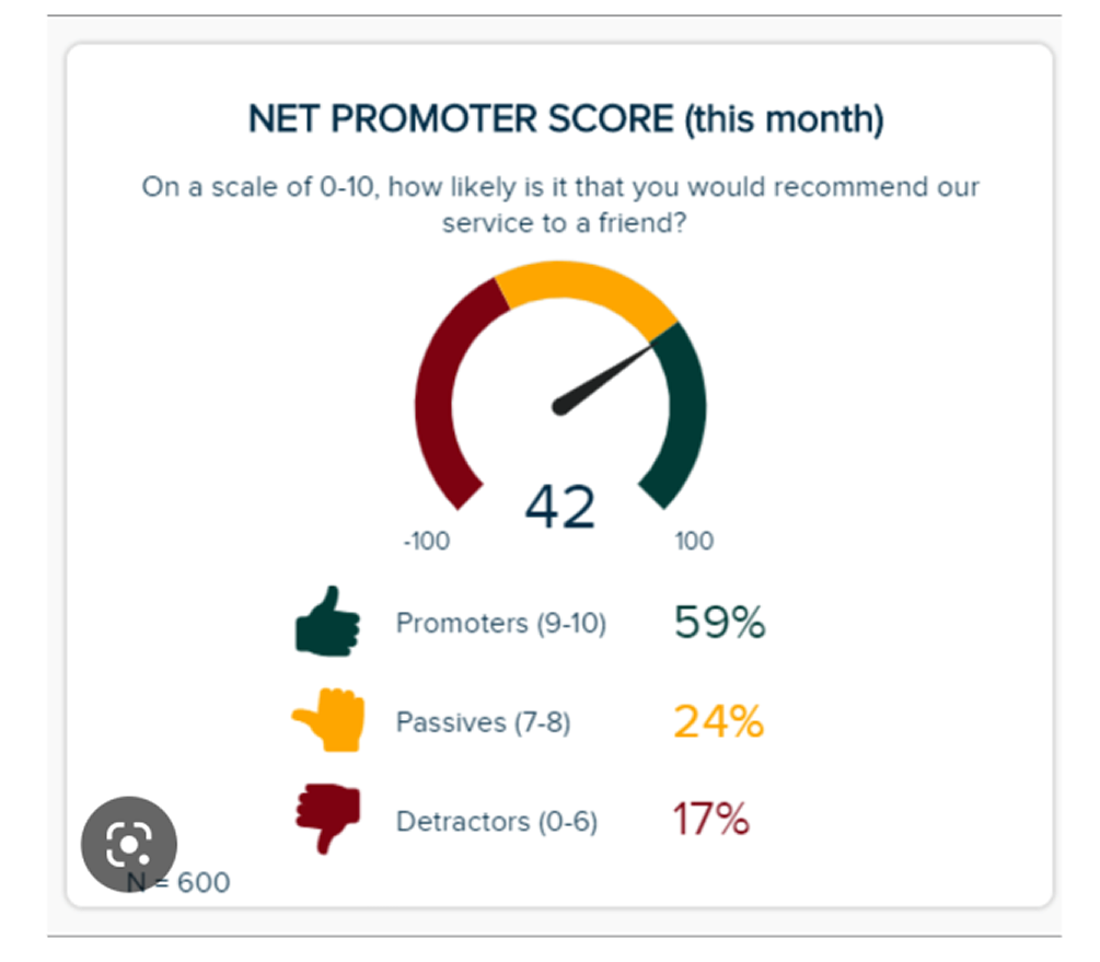
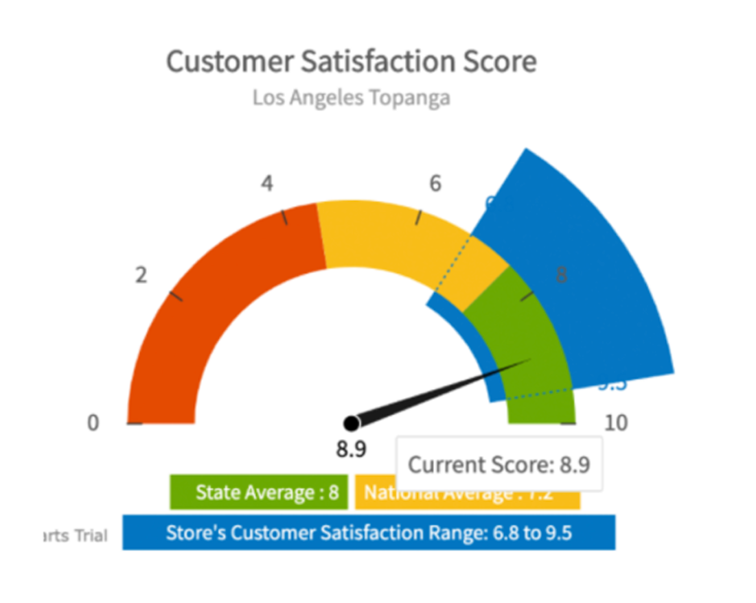
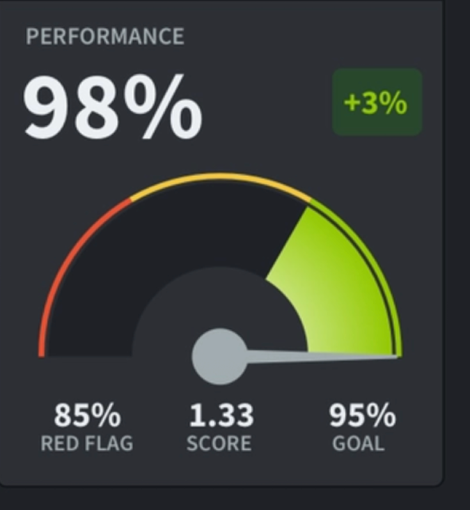
One early direction involved gauge-style visualizations, often used to indicate progress, thresholds, or “good vs. bad” states at a glance.
Why We Explored Gauges
Gauges initially seemed promising because they:
Clearly communicate relative position (e.g. below average vs. above average)
Imply benchmarks and targets intuitively
Are familiar to users in performance-driven dashboards
We evaluated whether a gauge could help users quickly understand where a firm landed relative to an average or expected range.
While it was important to involve our user’s as early on in the process as possible to make sure we were designing with their needs in mind, we wanted to make sure we had a strong visual direction, especially since internally we were debating this best possible design.
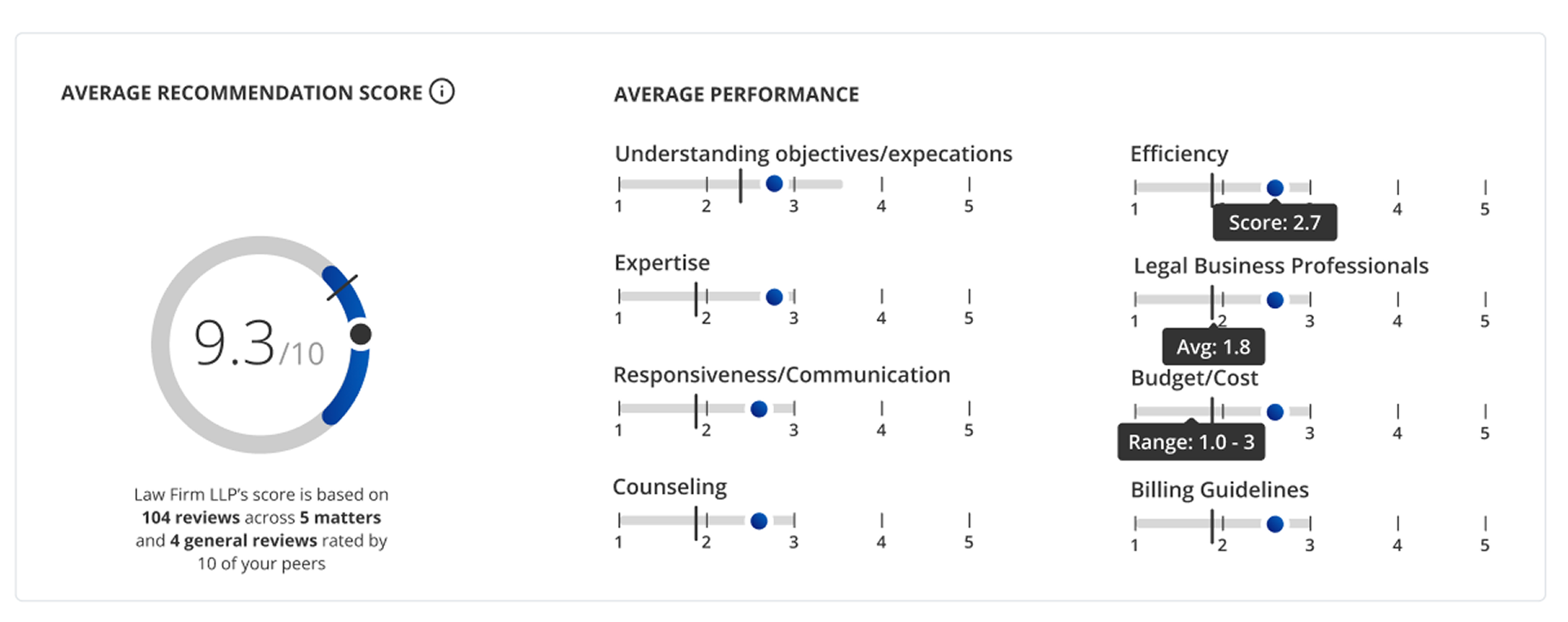
Instead of replacing the pie chart entirely, I focused on progressive enrichment by taking a familiar visualization and layering in meaning.
Key principles:
Familiar first, smarter second: Build on what users already recognize
Context over decoration: Every added element must answer a real question
Clarity at a glance: Insight should emerge within seconds, not minutes
Final Approach
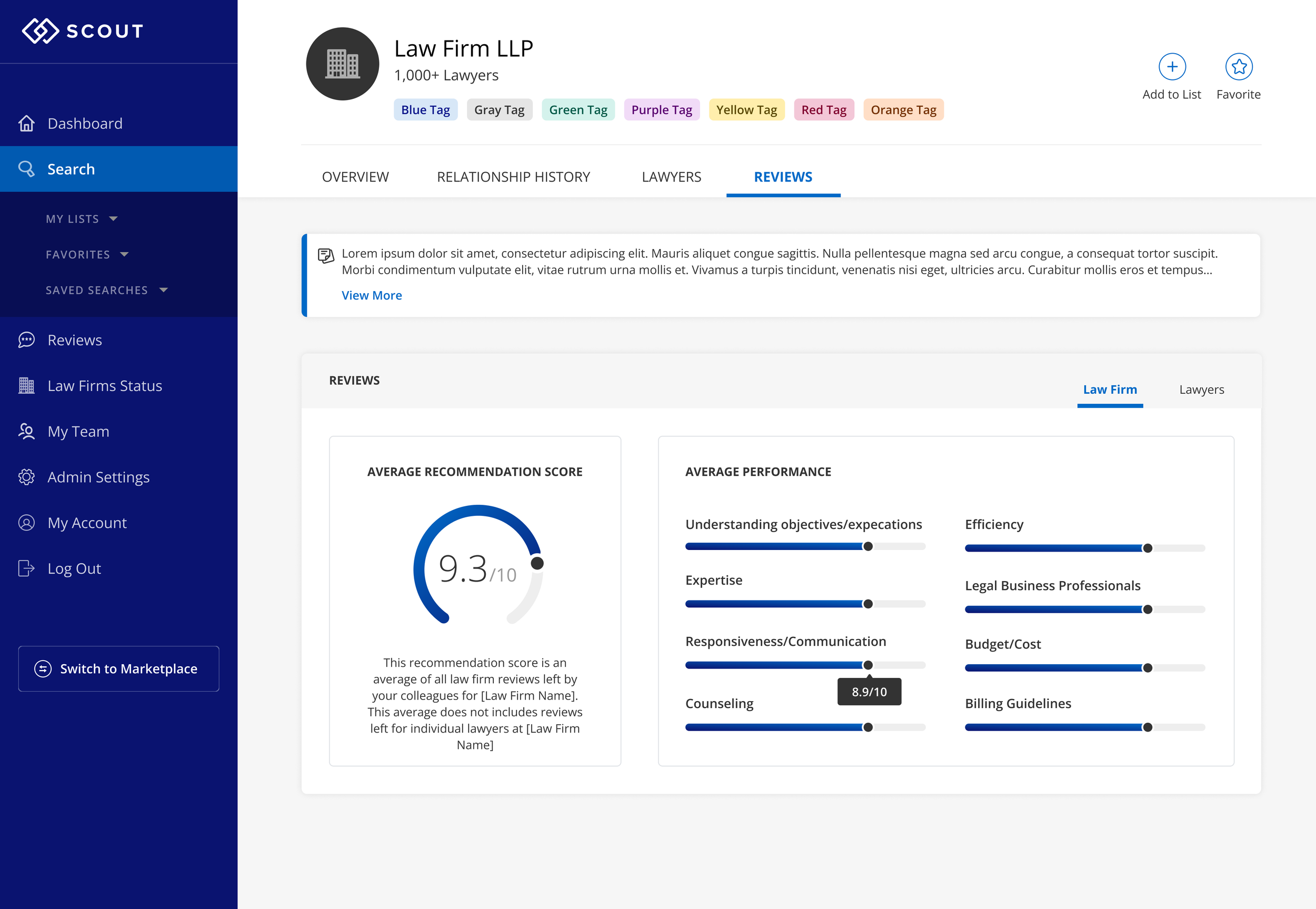
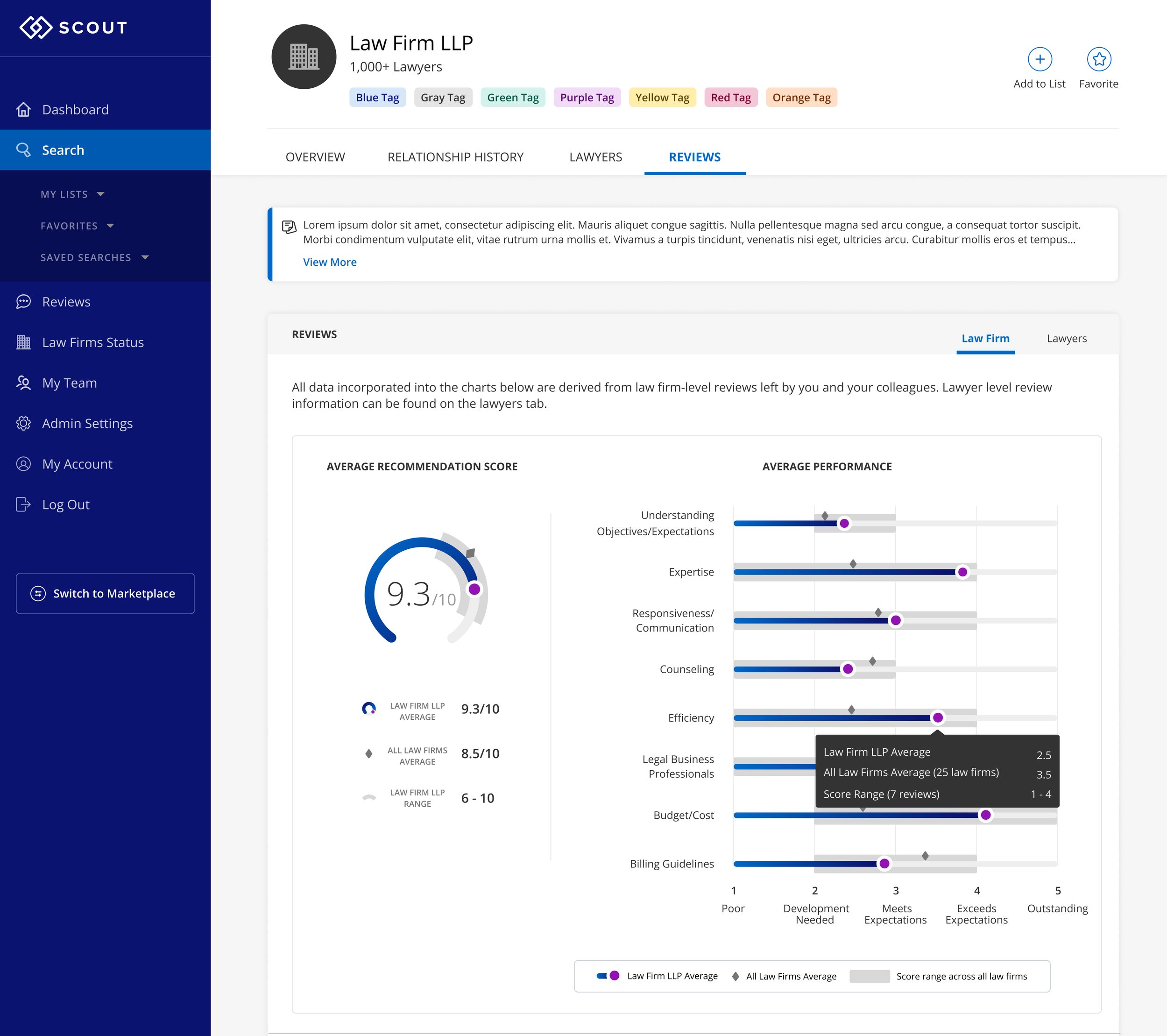
When we finally agreed on the key metrics to display (law firm average; aggregate average; range), we decided to overlay the data on our original gauge. On the bar graphs to the right, we found that the same average and range elements lent themself to that design as well.
We used different gradients to indicate law firm vs lawyer.
Impact
By evolving a single-metric pie chart into a more contextual, comparison-driven visualization, the experience shifted from passive data viewing to active understanding.
Faster Time to Insight
Embedding averages and benchmarks directly into the visualization reduced the need for users to:
Cross-reference other screens
Perform mental calculations
Interpret values without context
As a result, users could assess relative firm performance more quickly and with greater confidence.
Increased Confidence in Decision-Making
The added visual context clarified why a data point mattered.
This helped:
Reduce ambiguity around outliers
Make performance differences easier to justify internally
Support clearer, more defensible decisions
The visualization became something users could point to and explain, not just observe.
Reduced Cognitive Load
By surfacing comparative signals directly in the chart, the design removed unnecessary interpretation work.
Key insights were visible at a glance
Visual hierarchy guided attention to what mattered most
Complexity was absorbed by the design, not the user
This made the data feel lighter, even as it became more sophisticated.
A Reusable Visualization Pattern
Beyond this specific chart, the work established a scalable pattern for displaying comparative metrics across the product.
Easier to extend with new data points
Reduced design and engineering rework
More consistent data storytelling across Priori
Stronger Product Value
Clearer data visualization reinforced Priori’s core promise: enabling better decisions around legal spend and firm selection.
By helping users understand data faster and more deeply, the product delivered insight which allowed them to make better, data-informed decisions.